Papad Label Design
Project Title: Packaging Design for Swadisht Papad
Client: Paucek and Lage
Industry: Food & Beverage (Snack Foods)
Services Provided by Dipanshutech: Graphic Design, Packaging Design
Project Overview:
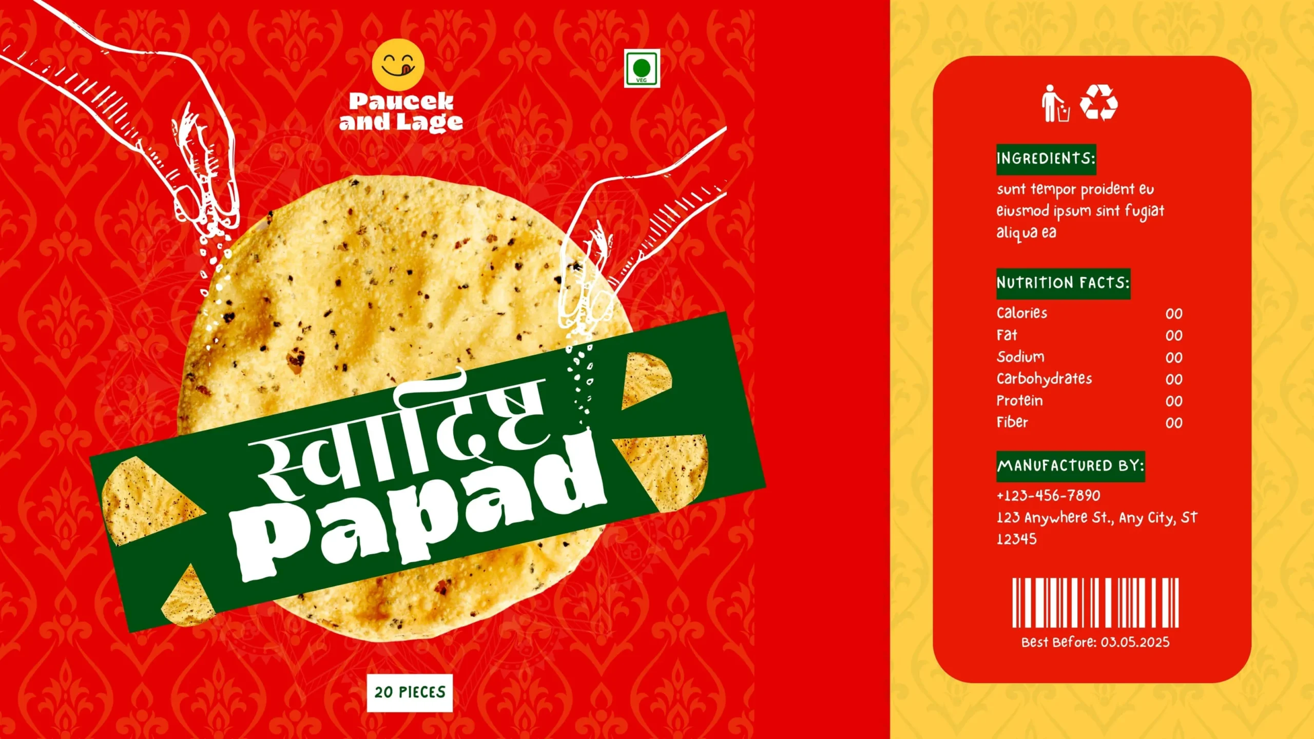
Dipanshutech was entrusted with creating a vibrant and appealing packaging design for Swadisht Papad. The objective was to develop a design that showcased the product, communicated its deliciousness (implied by “Swadisht,” which means tasty), and provided essential product information in an attractive manner.
Design Elements and Approach:
- Brand Integration: The “Paucek and Lage” brand name and logo (a smiling face) are prominently displayed at the top, establishing brand recognition and a friendly feel.
- Product Focus: A large, appetizing image of the papad is centrally placed, allowing consumers to see the product clearly. The name “स्वादिष्ट Papad” (Swadisht Papad) is overlaid in a stylized green banner, making it the focal point.
- Visual Appeal: The red background with subtle traditional Indian patterns adds cultural context and visual interest. The torn edges on the packaging illustration suggest freshness and easy opening.
- Quantity Indication: “20 PIECES” is clearly mentioned, informing the consumer about the pack size.
- Ingredient List: A placeholder text block is provided for the ingredient list.
- Nutrition Facts Panel: A placeholder nutrition facts panel with zeros indicates where this information would be displayed.
- Manufactured By Information: Placeholder contact details for the manufacturer are included.
- “Best Before” Date: A clearly marked “Best Before: 03.05.2025” provides important shelf-life information.
- Recycling Symbol: The inclusion of a recycling symbol encourages environmentally conscious disposal.
- Green Dot Symbol: The presence of a green dot symbol (common in some European packaging regulations, indicating financial contribution towards recycling efforts) might be relevant depending on the target market.
Impact and Outcome:
The resulting packaging design for Swadisht Papad is visually appealing and effectively showcases the product. The use of a large product image, vibrant colors, and cultural patterns aims to attract consumers. While some information is placeholder, the design provides a clear structure for essential details. Dipanshutech’s design focuses on creating packaging that is both eye-catching and informative for a snack food product.
Technology/Software Used: (You can add specific software your team used, e.g., Adobe Illustrator, Adobe Photoshop)
Team Involved: (You can mention the team members involved in the project)
Why This Fits Your Portfolio:
This project demonstrates Dipanshutech’s skills in:
- Graphic Design for Food Packaging (Snack Foods): Creating attractive and culturally relevant packaging for snack products like papad.
- Visual Hierarchy: Effectively using layout and color to draw attention to key elements like the product image and name.
- Cultural Sensitivity (Implied): Incorporating design elements that resonate with the product’s origin and target market.
- Clear Presentation of Essential Information: Providing designated spaces for ingredients, nutrition facts, and shelf-life information.
- Brand Integration: Seamlessly incorporating the client’s brand name and logo.
You can further enhance this portfolio entry by adding:
- Mockups of the actual papad packaging (e.g., a sealed pouch).
- Information about the target audience and how the design caters to them (e.g., those familiar with or interested in Indian snacks).
- If available, the actual ingredient list and nutritional information to show a complete design.
- Insights into the design choices, such as the color palette or the style of the product name’s banner.
![]()
Leave a Review
No reviews yet.