Lavender Essential Oil Label Design
Project Title: Packaging Design for Kamelus Lavender Essential Oil
Client: PeepeerWoodd
Industry: Health & Wellness, Aromatherapy
Services Provided by Dipanshutech: Graphic Design, Packaging Design
Project Overview:
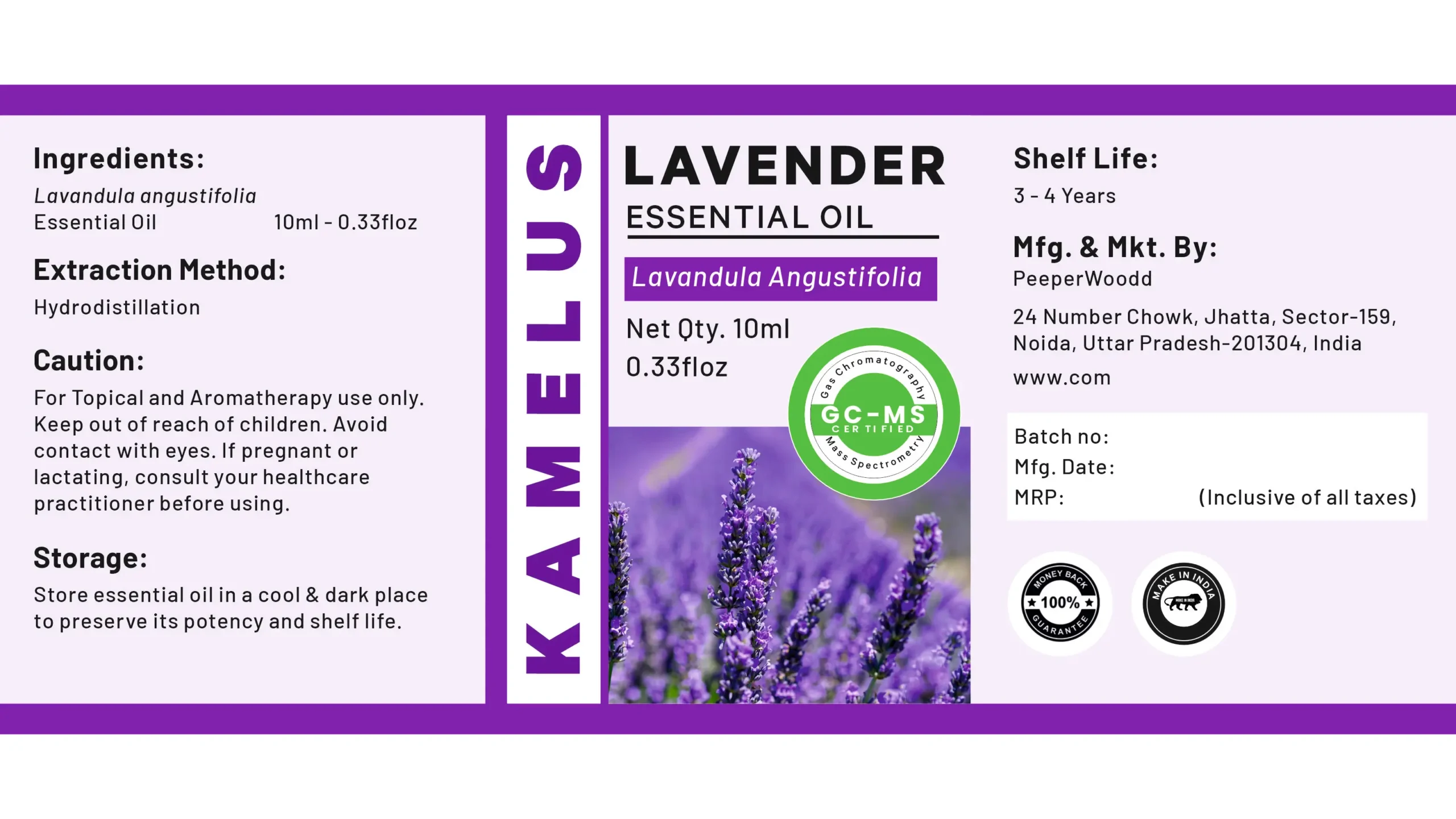
Dipanshutech partnered with PeepeerWoodd to create a clean, informative, and appealing packaging design for their Kamelus Lavender Essential Oil. The objective was to design a label that communicated the natural essence of the product, provided essential usage and safety information, and aligned with the brand’s focus on quality.
Design Elements and Approach:
- Brand Identity: The prominent display of the “KAMELUS” brand name in a vertical orientation creates a unique and memorable visual element.
- Product Focus: The label clearly states “LAVENDER ESSENTIAL OIL” and includes the botanical name “Lavandula Angustifolia,” informing the consumer about the specific type of essential oil.
- Visual Imagery: A serene image of blooming lavender fields evokes the natural origin and calming properties of the oil.
- Color Scheme: A soothing color palette of purples and whites reinforces the association with lavender and cleanliness.
- Clear Information Hierarchy: The label is logically divided into sections for ingredients, extraction method, cautions, storage, net quantity, shelf life, and manufacturing/marketing details, ensuring easy readability.
- Emphasis on Quality: The inclusion of a “100% Pure & Natural” badge and a “Made in India” emblem highlights the product’s quality and origin.
- Certification: The presence of a “GC-MS Certified” logo adds a layer of trust and scientific validation to the product’s purity.
- Concise Instructions and Warnings: Clear and concise instructions for topical and aromatherapy use, along with necessary cautions, prioritize user safety.
- Manufacturer Information: Complete contact details for PeepeerWoodd, including address and website, are provided for consumer inquiries.
Impact and Outcome:
The resulting packaging design for Kamelus Lavender Essential Oil is both aesthetically pleasing and highly informative. It effectively communicates the product’s natural attributes, quality certifications, and essential usage guidelines. Dipanshutech’s design aimed to create a label that builds consumer trust and encourages informed purchasing decisions within the aromatherapy and wellness market.
Technology/Software Used: (You can add specific software your team used, e.g., Adobe Illustrator, Adobe Photoshop)
Team Involved: (You can mention the team members involved in the project)
Why This Fits Your Portfolio:
This project showcases Dipanshutech’s expertise in:
- Graphic Design for Product Labels: Creating visually appealing and informative labels for consumer products.
- Information Design: Organizing and presenting crucial product details in a clear and accessible manner.
- Brand Communication: Reinforcing brand values through design elements and messaging.
- Understanding Regulatory Requirements: Ensuring necessary information and warnings are included for consumer safety.
- Working with Clients in the Health & Wellness Sector: Tailoring design solutions to the specific needs of this industry.
You can further enhance this portfolio entry by adding:
- Mockups of the essential oil bottle with the label applied.
- Insights into the design choices and the rationale behind them.
- Any positive feedback received from the client.
![]()
Leave a Review
No reviews yet.


