top packaging design company for water Greater Noida
Project Title: Premium Herbal Hair Oil Label Design for Natural Hair Care Brand
Client: Confidential (Emerging Ayurvedic Hair Care Brand)
Industry: Beauty & Personal Care / Herbal & Ayurvedic Products
Services Provided by Dipanshutech:
- Custom Label Design
- Branding & Packaging Design
- Typography & Color Strategy
- Print-Ready File Preparation
- Product Visualization Mockups
Project Overview:
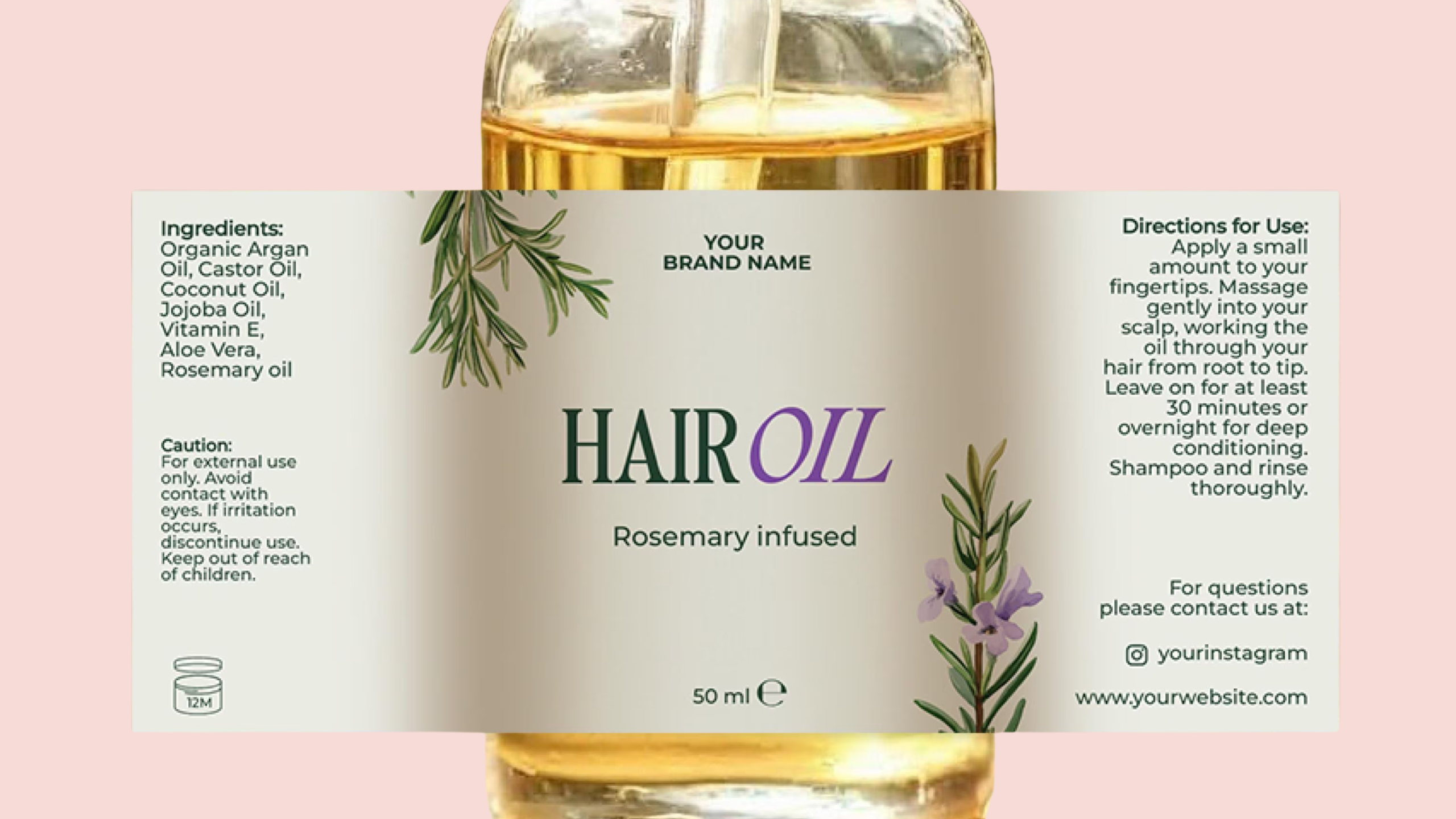
Dipanshutech designed a premium and visually appealing label for a herbal hair oil brand focused on natural ingredients and traditional Ayurvedic benefits. The goal was to create a design that reflects purity, trust, and effectiveness while standing out on retail shelves and online marketplaces.
The label highlights key ingredients such as amla, bhringraj, and coconut oil, while maintaining a clean and professional look that appeals to modern consumers seeking organic hair care solutions.
Design Elements and Approach:
- Color Palette: Earthy greens and rich browns to represent nature and herbal authenticity
- Typography: Elegant and readable fonts to ensure clarity and premium feel
- Imagery: Subtle botanical illustrations to emphasize natural ingredients
- Layout: Balanced composition with clear hierarchy for brand name, benefits, and usage instructions
- Brand Identity: Designed to build trust and reflect Ayurvedic heritage with a modern touch
Why This Fits Your Portfolio
This project showcases Dipanshutech’s expertise in creating high-quality, market-ready label designs tailored for the beauty and wellness industry. It demonstrates strong skills in combining aesthetics with functionality, ensuring the product stands out while effectively communicating its benefits.
![]()
Leave a Review
No reviews yet.