professional graphic designer Greater Noida
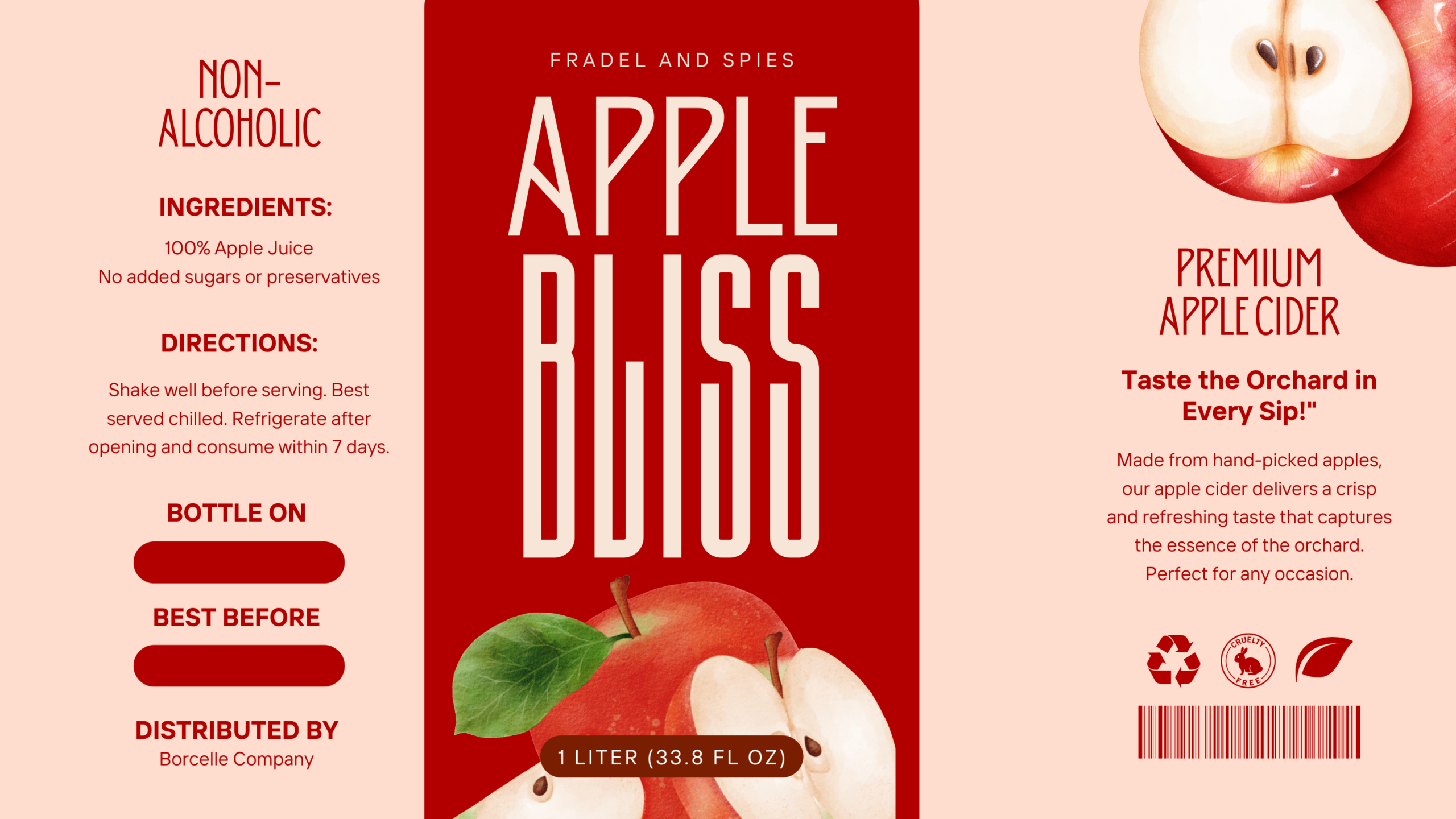
Project Title: Packaging Design for Fradel and Spies Apple Bliss Premium Apple Cider
Client: Fradel and Spies
Industry: Food & Beverage (Beverages – Cider)
Services Provided by Dipanshutech: Graphic Design, Packaging Design
Project Overview:
Dipanshutech was commissioned to create a packaging design for Fradel and Spies’ Apple Bliss Premium Apple Cider. The objective was to develop a design that communicated the premium quality, natural ingredients, and refreshing taste of the non-alcoholic cider, while providing clear product information and appealing to consumers seeking a high-quality beverage.
Design Elements and Approach:
- Brand Integration: The “FRADEL AND SPIES” brand name is displayed at the top, establishing brand recognition. The product name “APPLE BLISS” is prominently featured in a modern, slightly stylized font.
- Product Focus: The use of the word “APPLE” and realistic images of fresh apples and apple slices immediately conveys the core ingredient and flavor. The description “PREMIUM APPLE CIDER” reinforces the product’s quality.
- Emphasis on Naturalness: The ingredient list (“100% Apple Juice,” “No added sugars or preservatives”) is clearly stated, highlighting the natural and wholesome aspects of the cider.
- Clear Directions: Concise directions for serving and storage ensure optimal consumer experience and product longevity after opening.
- “Taste the Orchard in Every Sip!” Tagline: This evocative tagline creates a sensory connection with the product and emphasizes its fresh, natural taste.
- Descriptive Product Information: A short paragraph elaborates on the cider-making process (“Made from hand-picked apples…”) and its taste profile, appealing to consumers seeking quality and flavor.
- Non-Alcoholic Designation: Clearly stating “NON-ALCOHOLIC” ensures the product’s suitability for a wide range of consumers.
- Net Volume: The net volume (1 LITER / 33.8 FL OZ) is clearly indicated.
- Barcode Integration: A prominent barcode ensures efficient product scanning.
- Quality Seals (Implied): The inclusion of circular seals (though their specific meaning isn’t detailed) suggests a focus on quality and potentially certifications. The leaf symbol further reinforces the natural aspect.
- “BOTTLE ON” and “BEST BEFORE” Fields: Designated areas for this crucial information ensure traceability and inform consumers about the product’s shelf life.
- Distributed By Information: The “Distributed By Borcelle Company” clearly identifies the distributing entity.
- Color Palette: A clean and inviting color scheme of red, white, and light beige/cream evokes the natural colors of apples and creates a sense of freshness and premium quality.
Impact and Outcome:
The resulting packaging design for Fradel and Spies Apple Bliss Premium Apple Cider is visually appealing, informative, and effectively communicates the product’s key attributes. The combination of realistic imagery, clear information, and emphasis on natural ingredients and premium quality aims to attract consumers seeking a refreshing and high-quality non-alcoholic beverage. Dipanshutech’s design focuses on creating packaging that is both attractive and trustworthy.
Technology/Software Used: (You can add specific software your team used, e.g., Adobe Illustrator, Adobe Photoshop)
Team Involved: (You can mention the team members involved in the project)
Why This Fits Your Portfolio:
This project demonstrates Dipanshutech’s skills in:
- Graphic Design for Beverages (Cider): Creating appealing and informative packaging for the beverage industry, specifically for cider products.
- Communicating Product Attributes: Clearly highlighting key selling points such as “Premium,” “Non-Alcoholic,” and “100% Apple Juice.”
- Using Evocative Language and Imagery: Creating a sensory connection with the product through taglines and realistic visuals.
- Providing Clear and Concise Information: Presenting ingredients, directions, and net volume in an easy-to-understand format.
- Designing for Premium Products: Utilizing layout, typography, and imagery to convey a sense of quality.
You can further enhance this portfolio entry by adding:
- Mockups of the apple cider bottle with the label applied.
- Insights into the design process, such as the font choices or the rationale behind the color palette.
- Information about the target audience and how the design caters to them (e.g., consumers seeking natural and premium non-alcoholic beverages).
- Any feedback received from Fradel and Spies regarding the design’s effectiveness.
![]()
Leave a Review
No reviews yet.